Introduction
- The mobile landscape is evolving with foldable phones and tablets gaining significant market traction. Devices like the Samsung Galaxy Fold, Huawei Mate X, and Surface Duo are pioneering in this space, offering users a hybrid experience between phones and tablets.
- As developers, it’s essential to ensure our apps provide seamless user experiences across these new form factors. Apps that don’t adapt to different screen sizes or folding configurations might appear broken or inefficient on these devices, which can lead to poor user retention.
- Flutter, with its cross-platform capabilities, is well-equipped to handle this challenge. This blog explores strategies to adapt Flutter apps for foldable devices and large screens.
1. Why Focus on Foldable and Large Screen Devices?
- Market Trends: Foldable devices have seen substantial growth since their introduction. Companies like Samsung and Microsoft are doubling down on these designs, while Android and iOS platforms are offering better support for foldable displays.
- User Engagement: Users expect apps to work flawlessly on all devices they own, from small phones to large tablets. Apps that don’t adapt to foldable displays or larger screens will lead to a fragmented user experience.
- Business Impact: Developers who prioritize adapting to foldable and large screens gain a competitive edge, reaching more users and retaining them through enhanced app usability and aesthetics.
Example: The Samsung Galaxy Fold saw an increase in multi-tasking and app
continuity, making it crucial for developers to optimize their apps accordingly.
2. Flutter’s Strength in Adaptive Design
- Flutter provides a consistent UI across different platforms, making it easier for developers to create adaptive designs. Its declarative UI framework allows you to define how the UI should respond to different screen constraints in a straightforward manner.
- Widgets like
LayoutBuilder,MediaQuery, andOrientationBuilderare core tools for handling responsiveness. They help in detecting screen dimensions, pixel density, orientation, and even foldable-specific configurations. - Platform-Agnostic: Since Flutter is cross-platform, when you adapt your app for foldable or large screens on Android, it’s easier to make similar adaptations on iOS or web.
3. Handling Different Screen Sizes in Flutter
Dynamic Layouts with MediaQuery and LayoutBuilder:
- MediaQuery: Helps detect the available screen dimensions and orientation, making it ideal for adjusting layouts based on device size.
- LayoutBuilder: Allows you to build layouts that adapt to the parent constraints, making it possible to switch UI components dynamically depending on the screen width and height.
Example: Adapting a single-column layout for smaller devices and a two
column layout for tablets:
LayoutBuilder(
  builder: (context, constraints) {
    if (constraints.maxWidth > 600) {
      return LargeScreenWidget();  // Tablet or large screen layout
    } else {
      return SmallScreenWidget();  // Phone layout
    }
  },
);- Orientation Handling: Adjusting layouts based on landscape or portrait mode
using OrientationBuilder.
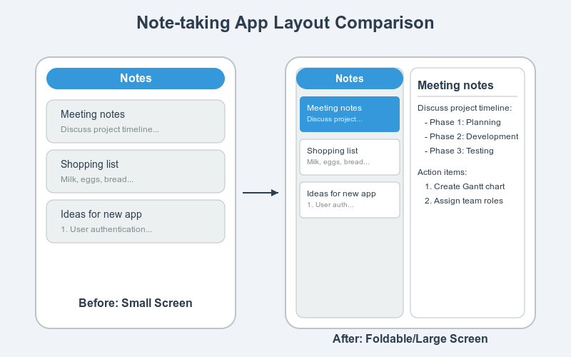
4. Building for Foldable Devices
Dual-Screen Optimization: Devices like the Surface Duo or Galaxy Fold have dual screens. When a user unfolds the device, the app should make use of the extra screen space. This could involve:
- Showing additional content on the second screen.
- Splitting content between the two screens for a multi-tasking approach.
Handling Hinge and Seam Awareness:
- Flutter doesn’t have built-in hinge detection, but third-party libraries and MediaQuery can be used to detect foldable configurations, allowing you to shift elements away from the hinge or use it strategically.
Code Example:
final hinge = MediaQuery.of(context).hinge;
if (hinge != null) {
  // Adjust UI around the hinge
}- Continuity and Transitions: Apps should maintain the current state (e.g., scrolling position, forms, etc.) when transitioning between folded and unfolded states. Flutter’s state management solutions like Provider or Riverpod can help with this.
5. Best Practices for Large Screen Optimization
- Responsive Layouts: When designing for larger screens, you should focus on delivering content that is either split or uses a multi-pane layout.
- Master-Detail Flow: Large screens offer the possibility of showing both the list of items (master) and the details of a selected item (detail) on the same screen, unlike on smaller devices where this would require separate screens.
- Using Flexible and Expanded Widgets: These widgets allow for more granular
control over how content is stretched or compressed within a layout. - Code Example for a multi-pane layout:
Row(
  children: [
    Flexible(
      child: LeftPanelWidget(),
    ),
    Flexible(
      child: RightPanelWidget(),
    ),
  ],
);
6. Using Flutter’s Adaptive Widgets
- Built-in Widgets for Responsiveness: Flutter provides a range of widgets such as
Expanded, FractionallySizedBox, and MediaQuery to adapt layouts based on screen
size. - Third-Party Packages: Libraries like responsive_framework help in creating a
scalable app layout, managing breakpoints, and making UI adjustments easier. - Adaptive Widgets: Newer adaptive widgets allow developers to cater to different
platforms like Android, iOS, web, and desktop more effectively.
8. Testing and Debugging for Foldables and Large Screens
- Testing on Emulators: Android Studio offers foldable device emulators like the Galaxy Fold or Surface Duo, allowing you to simulate foldable behaviors.
- Real Device Testing: If possible, testing on actual devices ensures accurate hinge detection, multitasking behavior, and layout adjustments.
- Tools: Mention tools like device_preview allows you to test across multiple devices simultaneously.
There are plugins available for both Visual Studio and Android Studio that can help you test your apps on foldable devices.
Visual Studio:
- Visual Studio Emulator: This built-in emulator allows you to simulate different
devices, including foldable devices, and test your app’s behavior and performance
on various screen sizes and orientations. - Third-party emulators: There are also third-party emulators available that offer
more advanced features and customization options for testing on foldable devices.
Android Studio:
- Android Emulator: Like Visual Studio Emulator, Android Studio’s built-in emulator
allows you to simulate different devices, including foldable devices, and test your
app’s behavior and performance. - Genymotion: A popular third-party emulator that offers a wide range of device
profiles, including foldable devices, as well as advanced features like GPU
acceleration and network simulation. - BlueStacks: Another well-known third-party emulator that supports a variety of
devices, including foldable devices, and offers features like multi-instance and
macro recording.
Tips:
Use real devices for final testing: While emulators are a valuable tool for testing, it’s
always recommended to test your app on real foldable devices before releasing it to
ensure optimal performance and user experience.
Here’s the link to Flutter’s official documentation for more details:
Flutter Official Documentation
Flutter – Build apps for any screen
Flutter package dual_screen: The dual_screen package provides tools for developing
apps that work across dual screens or foldables. It introduces widgets like TwoPane, which helps manage screen space effectively by dividing the app’s content across panes
depending on device type (e.g., foldable, tablet). The package also supports hinge angle sensors, which allow developers to adjust the UI based on the folding angle
Dart packages
Conclusion
- As mobile technology evolves, adapting your Flutter apps for foldable devices and larger screens is not just a trend—it’s a necessity. Creating adaptive and responsive UIs ensures that your users have an optimal experience, regardless of the device they use.
- The combination of Flutter’s powerful layout system, third-party libraries, and best practices allows you to future-proof your apps while leveraging new opportunities in the device market.