Creating a responsive user interface is a crucial aspect of mobile app development, ensuring that your application adapts seamlessly to various screen sizes.
In this blog post, we’ll explore a set of utility functions in Dart that make achieving responsiveness in Flutter a breeze.
Understanding the Utility Functions
1. getWidth Function
static double getWidth(var width) {
    var percent = ((width / mockupWidth) * 100);
    return ((deviceWidth * percent) / 100);
}
The getWidth function calculates the width based on a reference mockupWidth. It allows you to easily adjust the width of UI elements based on the device’s screen width.
2. getHeight Function
static double getHeight(var height) {
    var percent = ((height / mockupHeight) * 100);
    return ((deviceHeight * percent) / 100);
}
The getHeight function takes a height value and calculates a percentage based on a reference mockupHeight. It then converts this percentage to the corresponding height in terms of the device’s height. This utility is invaluable when specifying heights in a responsive Flutter layout.
3. getSp Function
static double getSp(var sp) {
     // Adjust font size based on mockupHeight
     var percent = (((sp - 0.25) / mockupHeight) * 100);
     return ((deviceHeight * percent) / 100);
}
The getSp function is tailored for handling font sizes. It calculates a percentage adjustment based on the font size, contributing to a responsive typography system in your Flutter app.
4. getRadius Function
static double getRadius(var radius) {
    return double.parse(radius.toString());
}
The getRadius function simplifies the process of obtaining a double value from a radius, providing a clean and straightforward way to handle border radii in Flutter.
The Role of Mockup Dimensions
In the foundation of our responsive design strategy, we’ve established mockup dimensions:
static var mockupHeight = 812; // Specify your mockup height
static var mockupWidth = 375; // Specify your mockup width
Why Mockup Dimensions Matter
- Consistency Across Devices:
By establishing mockup dimensions, you create a baseline for your design. This ensures that the visual elements are consistent, regardless of the screen size or device type.
- Precision in Layouts:
Mockup dimensions serve as a precise guide for calculating percentages and scaling factors in your responsive design calculations. This precision is crucial for maintaining the intended layout structure.
- Efficient Development:
Developers can work more efficiently when they have a predefined set of dimensions to reference. It streamlines the design-to-development process and reduces the guesswork involved in adapting layouts to different screens.
Introducing Utility Extensions
To enhance the conciseness and readability of our Flutter code, let’s introduce a set of extensions on numeric types. These extensions encapsulate our utility functions, providing a clean and expressive syntax for sizing and dimensions.
extension SizeExt on num {
   double get Sw => Util.getWidth(this);
   double get Sh => Util.getHeight(this);
   double get Sp => Util.getSp(this);
   double get r => Util.getRadius(this);
}
With these extensions, you can now effortlessly utilize utility functions for sizing and styling directly on numeric values. Let’s break down each extension:
- Sw : Represents the width of the device screen.
- Sh : Represents the height of the device screen
- Sp : Represents the scaled font size for responsive text.
- r : Represents the radius for styling rounded elements.
Integrating Responsive Design in Widgets
Now, let’s see how you can apply these utility functions within a Flutter widget to create a responsive layout:
In this example, the width, height, font size, and radius are all adjusted responsively using the utility functions, with mockup dimensions as the reference point.
By incorporating utility functions and extensions, this example becomes more concise, readable, and responsive. It encapsulates the layout adjustments within the utility functions, making the code cleaner and easier to maintain.
This approach aligns with Flutter best practices and promotes a consistent and efficient development workflow.
@override
Widget build(BuildContext context) {
return Scaffold(
body: Center(
child: Container(
alignment: Alignment.center,
padding: EdgeInsets.all(16),
height: 200.Sh, // Using utility function for
height
width: 200.Sw, // Using utility function for
width
color: Colors.cyan,
child: Text(
"Lorem Ipsum is simply dummy text of the
printing and”
"typesetting industry. Lorem Ipsum has
been the industry's standard dummy "
"text ever since the 1500s, when an
unknown printer took a galley of type",
style: TextStyle(fontSize: 16.Sp),
// Using utility function for font size
),
),
),
);
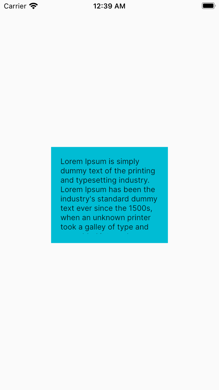
}Screenshot 1:
In the enhanced version, we leverage utility functions to make the code more concise and readable. The utility functions abstract away the calculations for height, width, and font size, resulting in a cleaner and more maintainable codebase.
Screenshot 2:
In the second screenshot, we define the widget layout directly within the build method. Although it’s functional, it lacks the abstraction provided by utility functions, resulting in more verbose code.

Conclusion:
These utility functions, combined with mockup dimensions, simplify the process of creating responsive designs in Flutter. Whether it’s adjusting heights, widths, font sizes, or radii, integrating these functions into your Flutter app ensures a consistent and visually appealing user experience across diverse devices.
Happy coding and may your Flutter app shine on screens of all shapes and sizes!